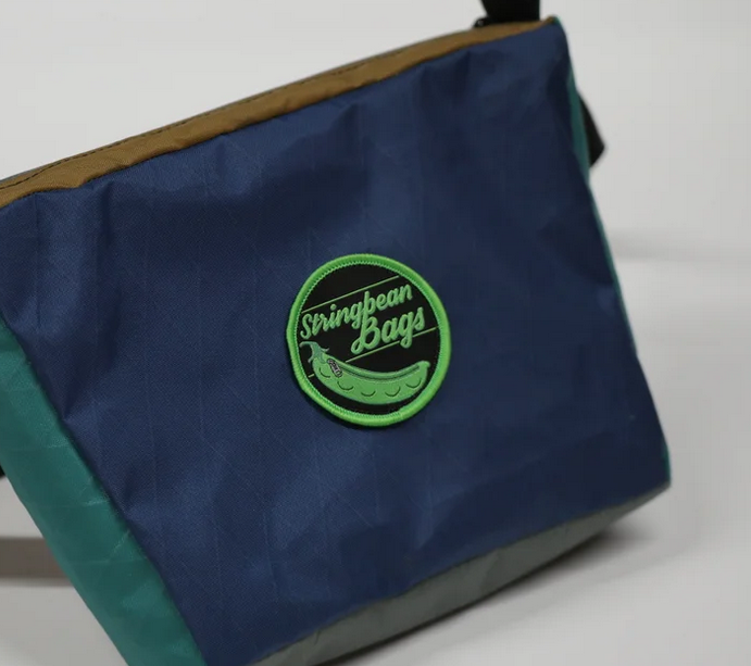
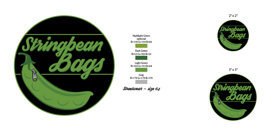
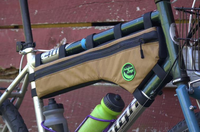
Another gig came my way, this time from a completely different direction. I was asked by a friend to come up with the logo, but more so a design for a patch that would be added to a bike bag. The basic premise was that the bag looks a lot like string bean. The idea is that these string bean bags would be bags made specifically for bikes where you would need to pack extra gear but that bag would specifically sit underneath or in the middle of the frame. A basic font was already picked by the company owner so that’s kind of where everything started.
It took a while to get the real world measurements right because the patch could only be so small, and then thread would have to be pretty small itself to be able to show all of the detail. That made it really difficult to guess how the thread would render.

As you can see some of the detail was lost because the thread could only be so small whereas the logo was a vector so representing design on a monitor is no problem. The real world however was a challenge.


Making patches really isn’t my forte but I guess I know what to do better next time…if there is a next time. So if you need a bike bag, go to stringbeanbags.
